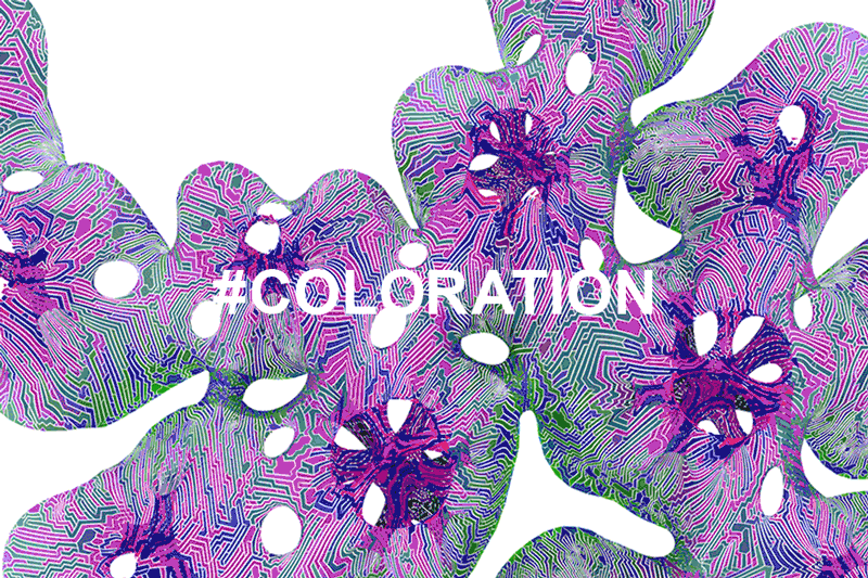
COLORATION VS COLOR
#Coloration: the Art of applying colors across a set of parts
Color is subjective, submitting to fashion and trends. To choose a color and then stand by it for years can take a toll on an architect. Hence a lot of white, black, and sometimes primary colors.
Computation and procedural protocols of tessellation have opened up a new paradigm for color. "Coloration," as we define it here at MARC FORNES / THEVERYMANY, is the procedural art of applying multiple colors across sets of parts.
The possibility for coloration lies in the distinction of FUZZY VS. STEPPED. The former is a smooth gradient, often executed by airbrush artist within the custom car industry. On the other hand, a stepped gradient strategizes on the parts-to-parts relationship. It is achieved through an array of many parts, each painted as a single, solid color within the controlled environment of a specialized shop, and mechanically assembled. The method allows the possibility for precise play on rhythm, period, contrast....
The narrative of coloration starts with the site: by considering the surrounding palette, even with the eyes of a child (blue from sky, green from grass), and pushing colors to a certain point of artificiality, playing on SIGNAL VS. CAMOUFLAGE. Through color, a project can stand out in its environment (an iconic place-maker) while at once blending in appropriately. Whether complement or contrast depends on one's perception.
The process of coloration is an extension of our approach to all aspects of computational design -- endless testing, learning and rebooting -- to maximize the experience and playfulness of each particular project.
THEVERYMANY Glossary of #COLORATION
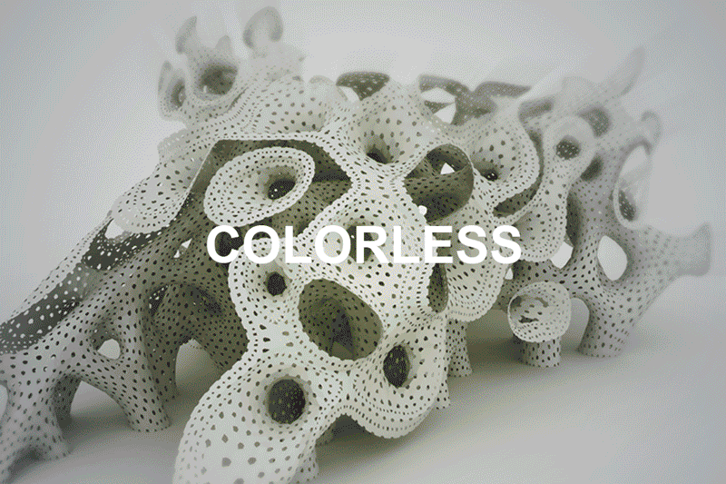
COLORLESS
Simple overall white or muted color. Acts as a blank canvas for highlights and shadows, allowing depth to be registered through the projected spectrum of shades of grey. Crafts an atemporal experience.
DOUBLE AGENT WHITE (Atelier Calder, Sache, France, 2011)
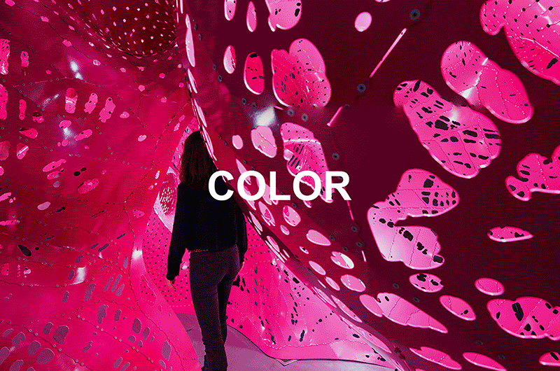
SINGULAR COLOR
Emblematic color as a signal and visual icon, editorialized by its particular cultural references. Augmented (through fluorescent), it absorbs shadows, making the experience of space depthless. Like an overcast ski day, one has to constantly blink to perceive contrast and understand distance.
SITUATION ROOM (Storefront for Art and Architecture, NYC, 2014)
JUXTAPOSITION
A play between two or more colors. Beyond mere the two-sided face A / face B, on / off, juxtaposition is an intricate relationship that involves moire, meandering, interweaves... Can be subtle, strong, complementary, opposing etc.
TOUR DE FORCE (Harmony of the Seas Cruise Ship, 2016)
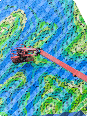
ZEBRA
A stepped pattern that switches back and forth between two or more constant colors. Characterized by rhythm, period and levels of contrast.
UNDER STRESS (INRIA, Rennes, France, 2014)
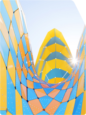
LINEAR GRADIENT
A transition of one color to another (and so on) evident on the whole, from part-to-part, yet each part itself is only one color.
PLEATED INFLATION (Argeles-Sur-Mer, France, 2015)
CHESHIRE
When a zebra meets a gradient: an interwoven pattern between a fixed solid color and a gradient. Re-appropriated by MARC FORNES / THEVERYMANY, "cheshire" is borrowed from the logical-fantastic universe of Alice in Wonderland by mathematician Lewis Carroll.
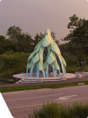
MIXED CHESHIRE
An interwoven pattern between two or more gradients. Each gradient has its own life and speed of change. Their sum creates something more. To be continued...
VAULTED WILLOW (Edmonton, AB, Canada, 2014)
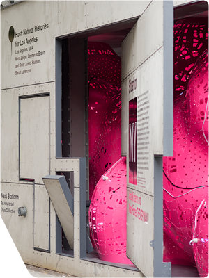
SOPHISTICATION
The complication of coloration, in which several patterns, gradients and colors interweave between moments (edges / center points / joints / etc.) of the whole. Characterized by local moments of intensity, and not necessarily with an overall order, sophistication requires multiple viewpoints to understand.
CHROMATAE (Denver Botanic Garden, 2011)